MoveOn Sports
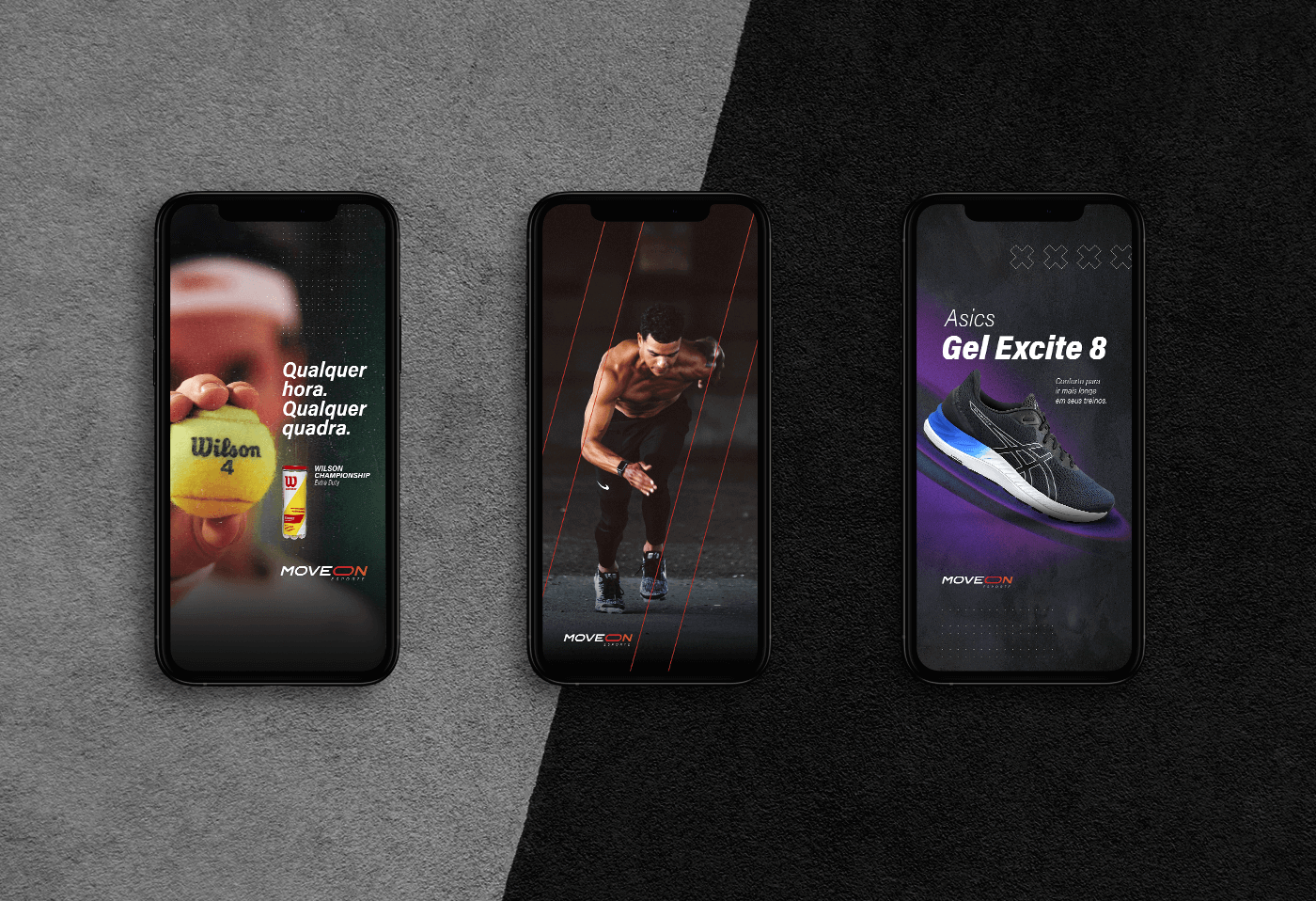
MoveOn was born to be a quality reference in retail stores with multi-brand sports materials and clothing.
Although the chosen market is very competitive, the visual identity was designed to stand out from others rental companies.
Its shape is a direct link to common elements in sports: sinuous lines and movements.
The brand expresses energy and elasticity, to represent the effort of physical activity, the flexibility and adaptability of athletes in the face of many challenges and the constant search for improvement.
- MoveOn Sports
- Retail sports stores
- Branding Design
- 2021
- STORM Comunicação


